Clients Don’t Just Want Food, They Want Memorable Experiences
Before the re-branding exercise, Amici Catering’s identity looked ‘forgettable’ and largely undifferentiated with other caterers in Singapore. The preceding website and touchpoints failed to communicate the brand’s most unique qualities, which is, being creative and personal. Food and styling did not support the brand’s premium boutique space nor depict its strength at being “best at conceptualizing and realizing creative event concepts”.
During the project, the team identified, through research, that more than catering, clients seek a food caterer partner in creating unique and ownable experiences, impressing guests with events they “remember and talk about”. At the same time, our research uncovered that the biggest names in catering were perceived as “too commercial” and “cookie-cutter”.

Being The Talking Point At Every Catering Event
Amici wanted to challenge the norm and be a ‘talking point’ at every catering event. This brand essence focuses on certain equities: sophisticated personal touches from a boutique company, vs. impersonal mass-market caterers and going beyond food via sophistication, showcasing experiences crafted with taste.

New Brand Identity - Making The “A” Mark
To stand out from the clutter of overly ornate, decorative brands, Amici’s visual strategy focused on simplicity.
We increased visual recall with a striking, ownable visual device, playing up “A” from Amici’s name, much like an artist’s signature or monogram. Online, offline, and on-site, the new identity was supported by art-inspired imagery, personality portraits, and tasteful storytelling.

Conveying Creativity Through Visuals & Copy Tone
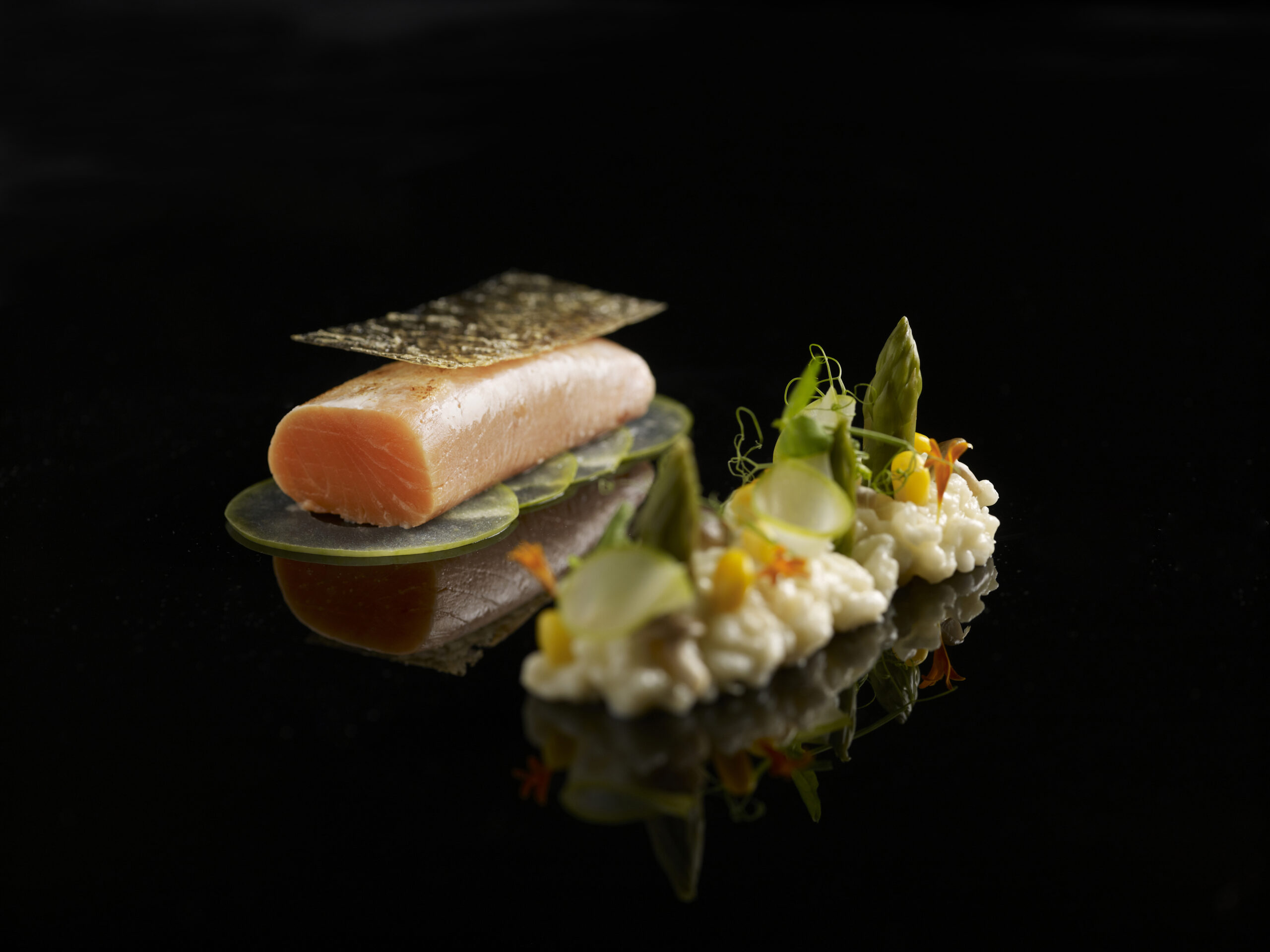
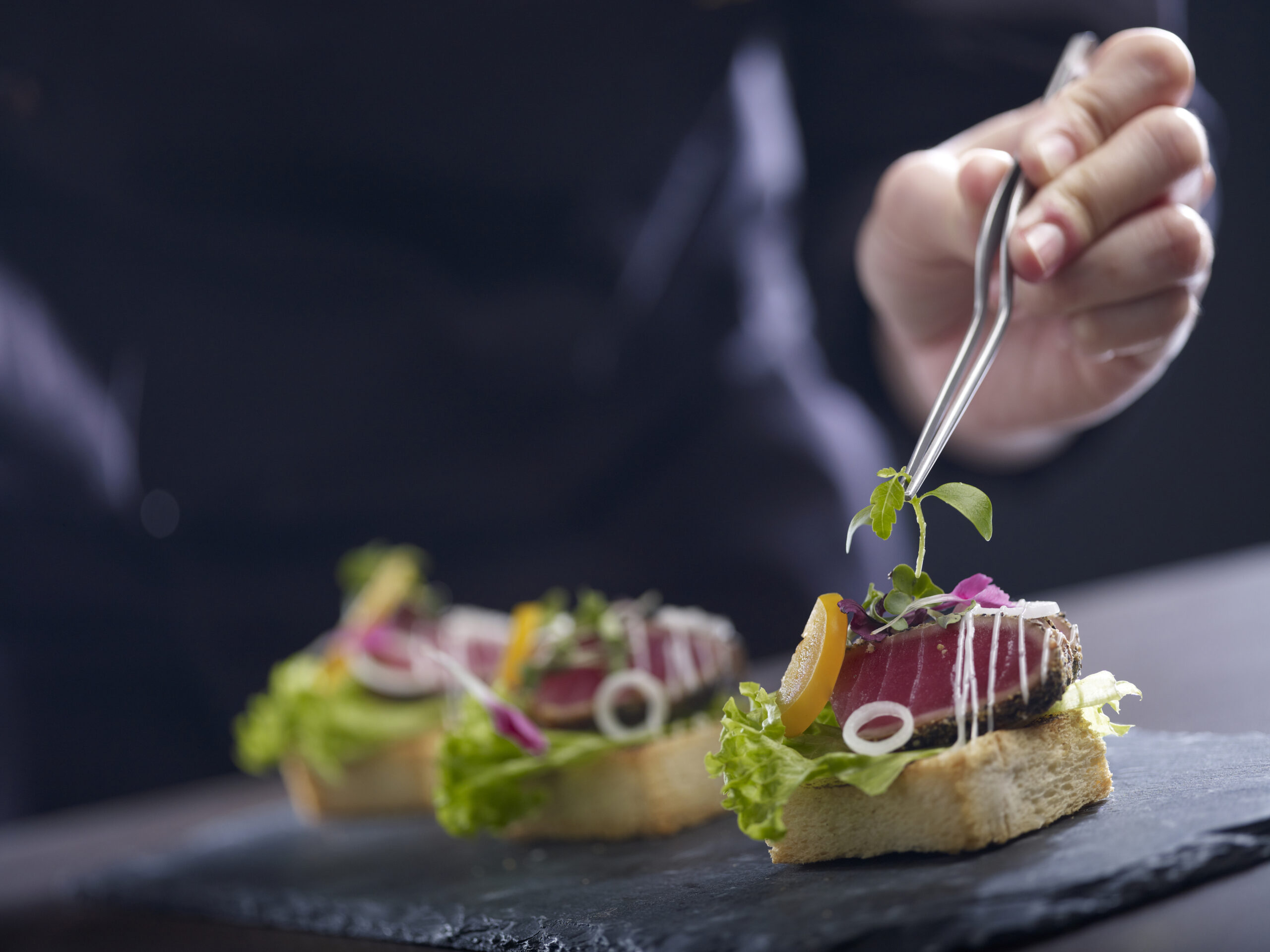
Typical catering campaigns put food and party setups at the forefront. We set Amici apart through carefully art-directed food shots, fresh and abundant ingredient imagery, and personality portraits of chefs, servers, project managers, and the management team.
The photographic style followed the same drama, attention to detail, and intimacy that go into each Amici event. The copywriting’s narrative voice took its cue from the brand’s name “Amici”, Italian for “friend”. The writing reads intimately, like stories exchanges among confidantes.

A Brand That Is Premium Yet Personal, Artsy Yet Approachable
Amici’s brand identity expresses a boutique caterer that’s premium, yet personable. The personality portraits highlight a human element that is often missing in other catering companies – the “people behind” a brand, the face you talk with and trust, the artist’s hands that carefully create your food.
Amici’s brand messages are simple yet artsy, appealing to the target audience by plainly yet elegantly stating the primary motivation to “give the diner something to talk about.”
The end-result? A refreshing, memorable brand that reflects the brand’s true capabilities.

